Hazine fundraised for the very first time in the summer of 2020 and since then, with your support, we’ve been able to pay our web hosting fees, launch a new visual identity, and translate some of our materials into Arabic, including an essay on Arabic typography and our digital visual resources guide. Most importantly, we have been able to pay our writers and editors: this has resulted in all sorts of new content, to resource guides for learning non-Arabic Sudanese languages, an inclusive pedagogy series, interviews and more. We are so grateful for the funds we received during last year’s campaign and what that has allowed us to achieve.
We value being able to pay our writers and editors, as well as expanding into Arabic; it is very rarely done in academia and publications like Contingent have paved the way in terms of paying their writers and team. We are grateful to them and hope to follow in their lead. Additionally, we are focused on providing a space and support for writers who might not be able to publish such work elsewhere: encouraging creative and intellectual freedom requires time and energy from our team and our writers. In order to offer more competitive fees to our writers –many of whom are freelance writers or graduate students from outside the US and Europe– and to fairly compensate our editors for their intellectual labor, we are launching our 2021 fundraising campaign, with an aim of raising 10,000 USD. In addition, the funds we raise will allow us to bring on guest editors for special series, further diversifying our content.
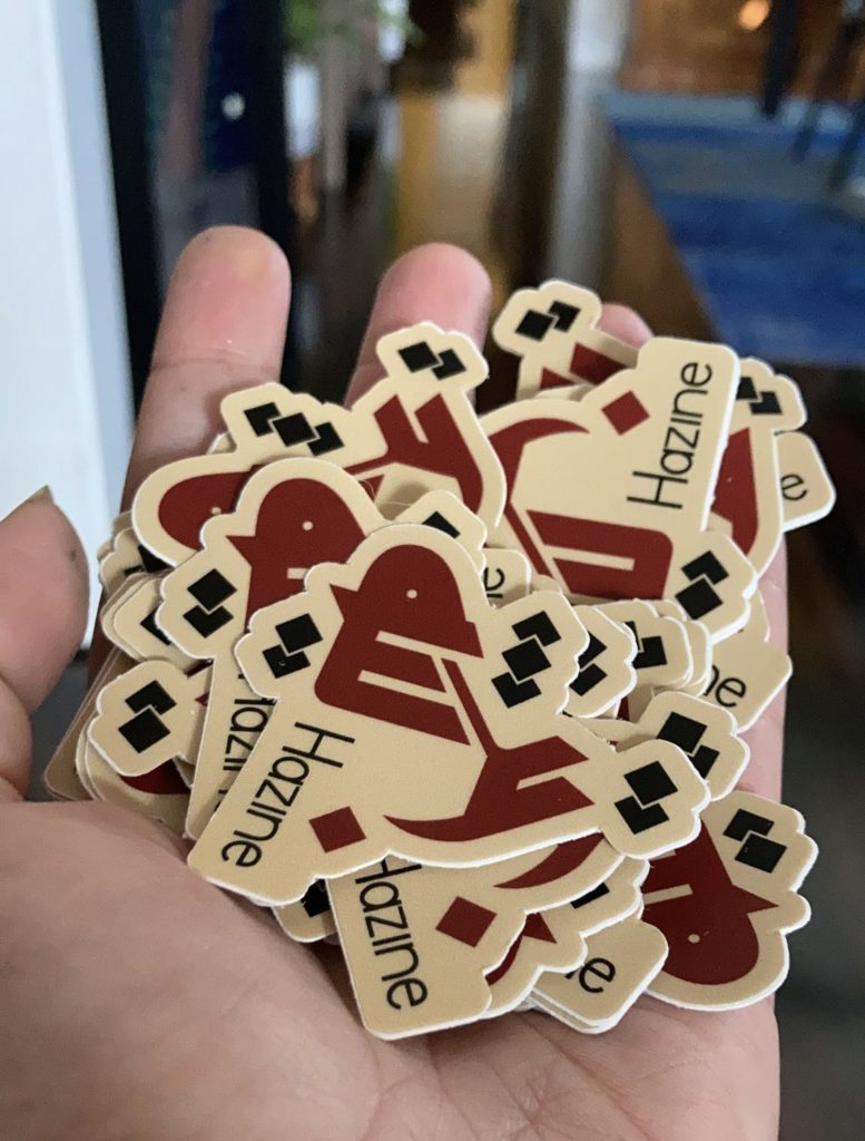
This year, in order to thank our donors, we’re able to send a small gift according to a tiered system. Our gifts are based on our visual identity, which is rooted in Islamic art and spearheaded by our arts editor, Marwa Gadallah. The best way to support our work is to set up a monthly donation to help us plan for the year.
You can also make a one-time donation equivalent to a year at one of the following levels ($5, $10, or $20) and receive the related thank you gifts:
- Set up a recurring donation of at least $5 a month and you’ll receive a bookmark, a postcard and a sticker.
- Set up a recurring donation of at least $10 a month and you’ll receive a bookmark, a postcard, a sticker and a magnet.
- Set up a recurring donation of at least $20 a month and you’ll receive a bookmark, a postcard, a sticker, a magnet and a tote.
Note to our current monthly donors: we will honor your continuing contributions and send you rewards that match the tiers. Please contact us at hazineblog{@}gmail.com if you haven’t heard from us already to send us an up-to-date postal address.
All of our donors will receive some small token of our thanks.
Use the form below to donate; please include your mailing address in the ‘Notes’ section. We are grateful for your continued support.

