By Marwa Gadallah
designed by Nadine Chahine
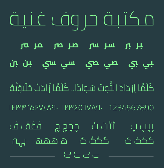
If you were becoming an Arabic type designer, one of the things you would need to consider, oddly enough, is Latin type design: much Arabic type design involves creating Arabic counterparts to existing Latin typefaces, a process known as typographic matchmaking. The Arabic script was incorporated into printing technology –outside of Arabophone contexts for the purposes of those who studied Islam for both academic and polemic purposes– roughly a century after the Latin script: Gutenberg, the inventor of Latin movable type, didn’t design printing with the Arabic script in mind. Arabic is composed of 28 letters, which have four letterforms (isolated, initial, medial and final forms), thus requiring a large number of type pieces to be created and the process was time-consuming. Today, while the computer allows us to communicate in Arabic without having to worry about the multiple letterforms, out of the same Gutenbergian legacy comes typographic matchmaking.
In typographic matchmaking, a type designer studies the letterforms of the Latin typeface they are interested in and incorporates their features into the design of Arabic letterforms while maintaining their physical appearance as Arabic letters. An example is Neue Helvetica Arabic, based on the Latin script typeface Neue Helvetica. Typographic matchmaking represents a cultural and practical discourse that Arabic type designers engage in as they work with Arabic type: consequently, Arabic speakers have few typefaces that they can rely on for day-to-day uses.
How an Arabic Typeface is Designed
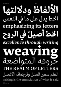
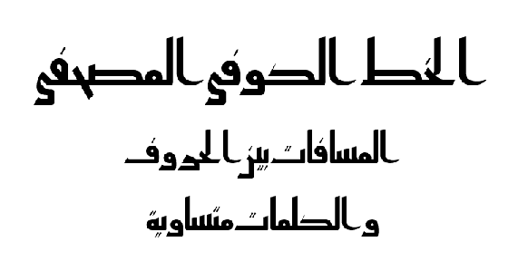
A Legible & Lucid Typeface,
29LT Zarid Text (Arabic and Latin)
type specimen poster, 29LT Blog
Let’s start by talking about how designers –like the prominent Arlette Haddad Boutros, Nadine Chahine, Pascal Zoghbi, Yara Khoury Nammour, Kristyan Sarkis and Mamoun Sakkal– create typefaces. To design an Arabic typeface, a type designer needs to have some bearing on classical Arabic scripts, like Naskh and Ruq’ah, to allow for legible and visually authentic letters. A type designer may use Naskh as a starting point for a body text typeface for use in large bodies of text due to its legibility, like the Arabic version of Pascal Zoghbi’s 29LT Zarid Text. To design a display typeface, a designer may start out with decorative Diwani, like Kristyan Sarkis’ Thuraya.
Yet, the vast majority of Arabic speakers have not reaped the benefits of the phenomenal work of Arabic type designers. Instead, teachers, business professionals, campaigners and others have been reusing the same computer fonts –like the Arabic versions of Arial and Times New Roman– for the lack of alternatives. Also, some Arabic typefaces that are influenced by Latin typefaces are poorly designed because they’ve lost some of the Arabic script’s aesthetic characteristics. In some cases, technical elements –such as connectors that exist between Arabic letters– are missing, making the fonts incomplete.
The Arabic Type Designer and the Western Experience
Arabic type design is a classed field, with the vast majority of Arabic type designers coming from the upper middle and upper classes and are, subsequently, educated at neo-liberal institutions. With virtually no programs in the Arab world that offer degrees in type design, designers with the means usually enroll in select programs abroad, like the University of Reading’s master’s degree in Typeface Design in the United Kingdom, to improve their Arabic type design skills. As such, neo-liberal attitudes manifest in, for instance, the use of English, rather than Arabic, in articles and interviews on type design; (yes, including this article itself). Naturally, monolingual Arabic speakers are unaware that much of this work exists: they are alienated from the type design community whose work should be serving them.
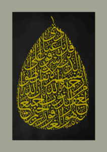
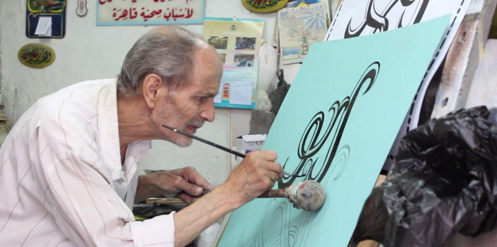
in the Thuluth script that displays a
Qur’anic verse, Shorouk News
Western perspectives often dictate what audiences Arabic type design should serve through what type design curricula privilege. For instance, Latin type design serves two broad applications: body text applications and headline/title applications. By adopting these same categories for Arabic type design, other potential categories associated with the culture of the Arabic script are eliminated. Unlike in the Latin script, the aesthetic qualities of the Arabic script, which include its letterforms’ connective features, allow it to be used in intricate compositions to adorn walls and buildings. Arabic calligraphy remains an important aspect of home decor, often represented in Qur’anic verses, like the prominent Egyptian calligrapher Khodeir El-Borsaidy‘s artwork. Today, some artworks are created digitally and exported as prints. Latin type categorizations do not take this decorative aspect of the Arabic script into consideration even though many intricate compositions are now created using vector tools, the same tools that are used to digitize typefaces.
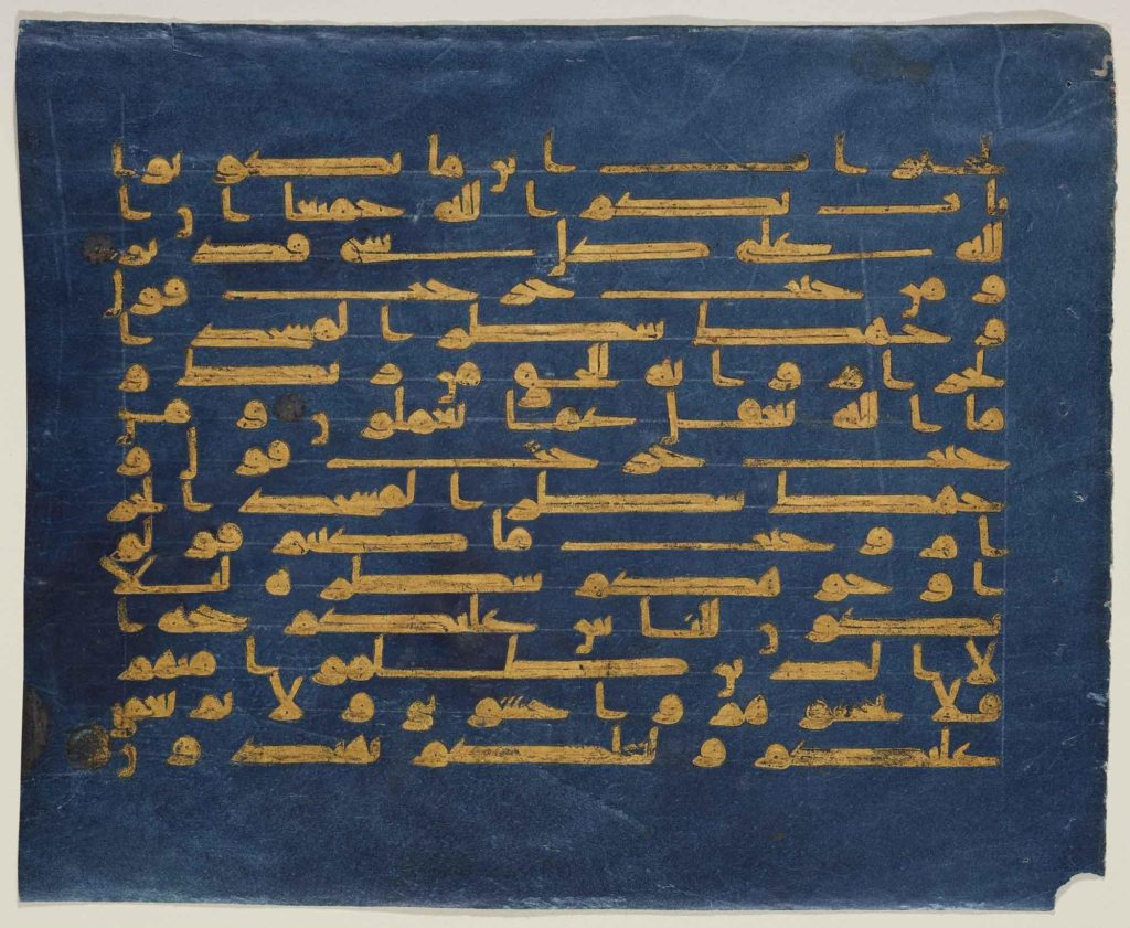
The body text and display categorization of typefaces is also too broad to encompass another significant aspect of Arabophone (and Islamicate) culture: sacred text. A large number of Muslims have a copy of the Qur’anic mushaf, often written in Naskh, to read from. Because of the addition of tashkeel and various symbols that show a reader where and how to stop while reading, more elements or glyphs are required in the mushaf than in any other body text application. Historically, most Arabic scripts, like Kufic, were used for both body and display text for adorning walls and buildings, thus requiring other categories to define them. Also, unlike contemporary Latin script, Arabic letterforms are influenced by calligraphic proportions and cannot merely be forced into the common Latin font characterizations of serif –small dashes at the ends of letters– and sans serif fonts because Arabic letters are not traditionally defined by serifs.
Moreover, there’s been a move towards a more secularized view of the Arabic script. Mouneer Alshaarani, a renowned Syrian calligrapher, claims that Arabic calligraphy has no connection to religion [Islam], that it is rather a result of the advancement of civilization and that religion has made use of the Arabic script, not the other way around. However, this denies that the Arabic script started becoming standardized when it was needed to copy the Qur’an by Arabophone calligraphers like Ibn Muqla, working in an Islamicate context, as Arabophone cultures were largely oral before Islam. Non-Muslims also employed scripts like Naskh in their own religious texts. To deny this history is to fetishize the Arabic script as an object of its study, thus alienating it from its cultural context. There’s an eerie parallel here with the colonial period when artifacts were taken from the mashriq and maghrib and placed in European museums that most Arabic speakers cannot access. Arabic type foundry websites that offer Arabic typefaces become works of fine art because Arabic speakers cannot make practical use of them – or afford them.
To deny this history is to fetishize the Arabic script as an object of its study, thus alienating it from its cultural context.
A Globalized World and Potential Solutions
In a world geared towards Western consciousness, success is generally associated with work done in English and for multinational corporations built on neo-liberal definitions of development. With some exceptions, most resources on Arabic type design are available in English. Also, many Arabic typefaces are made specifically for multinational corporations, like Apple and IBM, and cannot be sold or downloaded. Others are expensive typefaces not priced with the Arabophone world in mind. Furthermore, neoliberalism’s rejection of conceptions of identity associated with religion, which were significant for the Arabic script’s development, turns the Arabic script into an object of consumption to be used by corporations for monetary gain, devoid of its historical and cultural significance save for its visual characteristics. Also, while North America and Europe have created opportunities, like grants and awards, occasionally awarding ‘diversity,’ this is not normally the case in the Arab world, where type design work is not generally supported, creating an institutional barrier for Arabic type design efforts in the Arab world itself.
While these problems persist, some artists and practitioners interrogate the issues of Arabic type’s accessibility in the Arabophone world. One method involves using open-source licenses to create typefaces for the public, available online free of charge, and their original source files can be used and modified by anyone. Founded by Mohamed Gaber, the Kief Type Foundry offers open-source typefaces. Coming from a modest background in Egypt, Gaber, who receives funding from Google Fonts, understands the need for a “community foundry,” where anyone who needs a well-designed Arabic typeface can find one. He views these open-source typeface files as educational resources that novice designers can use to learn how letters are constructed. On several occasions, I’ve seen Gaber’s fonts Cairo and El Messiri being used by businesses and activists and I’ve used them myself. Khaled Hosny has also created open-source typefaces, like Amiri, based on Naskh and created with the mushaf in mind, and Qahiri, based on Mushafi Kufic. The typefaces’ open-source license allows other designers globally to engage with and build upon them.
Other initiatives promote access to type design material in Arabic. Founded by Huda Smitshuijzen AbiFarès in the Netherlands, Khatt Books, a branch of the Khatt Foundation, is concerned with disseminating type design research through bilingual books in Arabic and English. These books are, however, largely inaccessible among Arabic speakers: they are not available in print in the Arab world and are produced based on the purchasing power of a European audience interested in art, making them quite expensive. TYPE Lab, founded by Bahia Shehab, who Hazine recently interviewed, is making knowledge on Arabic type available online freely in both Arabic and English through images, short articles and talks. Through TYPE Lab, an open-source encyclopedia of Arabic letters will be launched for anyone interested in the Arabic script. There have also been scholarly attempts to define the Arabic script’s anatomy in Arabic, like Pascal Zoghbi’s work done in comparison to the Latin script’s anatomy and Azza Alameddine who works with historical Arabic calligraphic terminology.
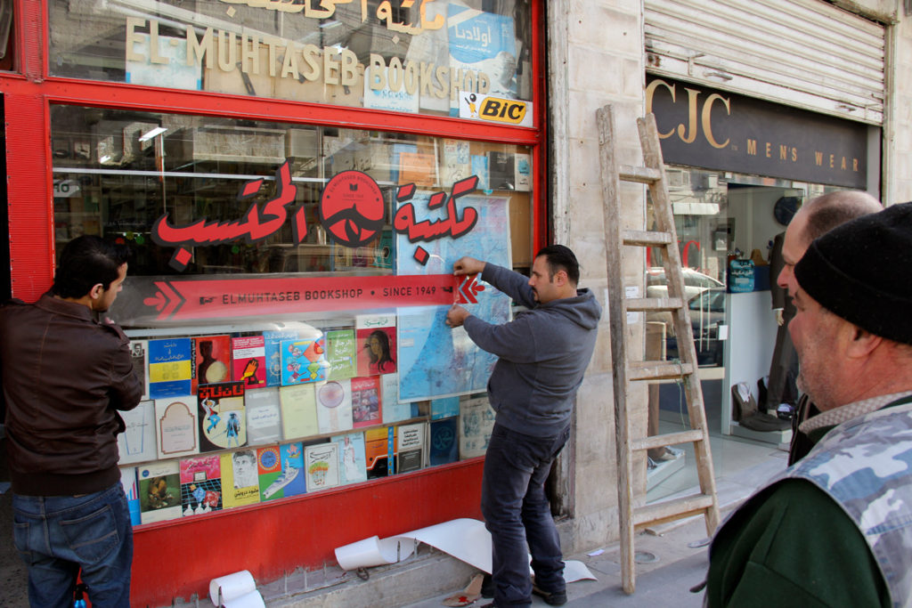
Another practical social initiative, Wajha, aims to improve the visual culture scene in Amman, Jordan by designing shopfronts and visual identities free of charge for small and modest shops whose owners cannot afford design services. ‘Facade’ in Arabic, Wajha was founded by Hussein Alazaat and Ali Almasri. Before working on a design, they learn about the shop’s history from the shop owner and what they envision. They then create well-designed Arabic typography and visuals for signage and other stationery, even involving a local calligrapher in their efforts. The product is a visual identity representing the owner, their shop and the culture of the community.
Challenging Neo-Liberal Conceptions
There is still a need to challenge neo-liberal conceptions of type design inconsistent with Arabic speakers’ needs. While typographic matchmaking was a significant first step towards learning when Arabic type design was still new, it may be time to move past this stage into a more thorough exploration of how Arabic type design can more effectively serve Arabic speakers. An autonomous physical or digital space for a dialogue on Arabic type design needs to be created, prioritizing what Arabic speakers need. It must involve Arabic speakers in the process of creating typefaces that they can relate to and use. One way is to organize focus groups among Arabic speakers and provide them with different materials to read in various typefaces to experiment with legibility, which was done by Sarah Shebl for her typeface Kalamon for children’s school books. Other focus groups can examine what Arabic speakers find culturally important by exploring what is generally found on their –physical and digital– bookshelves and documenting trends in community interests and needs.
Foreign and local funds need to be redirected towards initiatives and programs that allow Arabophone students to learn Arabic type design locally, in the Arabic language and without having to travel to Europe or the Americas. This reduces travel expenses, addresses the language barrier and encourages designers’ dedication to their culture through working with local calligraphers and engaging with their immediate community of Arabic speakers.
At this point, I wonder of the extent to which other languages, like Persian, Pashto, Urdu and Central Kurdish, that use the Arabic script have been impacted by the alienation manifest in typographic matchmaking, especially those that are less present on the type scene and have specific requirements. What cultures do those who speak these languages identify with? Why are they not involved in the type design process? Answering these questions will allow designers to move past much of the industrial homogeneity that has defined our written environments whether online or in printed form.
I would like to thank N.A. Mansour for her wonderful and patient guidance as we worked on this as well as her important insights on writing style and inclusivity; insights without which this essay would not be in its current form. More importantly, I thank her for her friendship.
Marwa Gadallah graduated from the Graphic Design program at the American University in Cairo. She is interested in Arabic calligraphy and illustration and its ability to convey abstract ideas and has done comic and illustration work. She is also interested in the issues of knowledge and resource accessibility in the Arab world, particularly within the arts.
Fascinating!