The Limits of Palestinian Art: An Exhibition Review of “If only this mountain between us could be ground to dust”

By N.A. Mansour

Image of a dark gallery room with a green carpet. 4 projectors are set upon wooden frames in the middle of the image, on the floor. On one wall is a projected image of the Palestinian hills at dusk or dawn. The same is projected onto the other wall, with a digital image of a scarred Palestinian child –with no gendered features– and there is yellow text projected across it that says “Where to become free”. Note that the wooden boards the images are projected onto are overlapping and are of different sizes.
Figure 1: Still from “At those terrifying frontiers,” with Palestinian hills in the background (Photo credit: N.A. Mansour)

Maybe I just have to resign myself to the fact that some Palestinian art is not made for me, a Palestinian.

When Palestinian culture is given some representation at major institutions and major publications, my instinct is to support it, even though I know diversity, equity and inclusion policies are instrumentalized as corporate tools. I try to be optimistic.

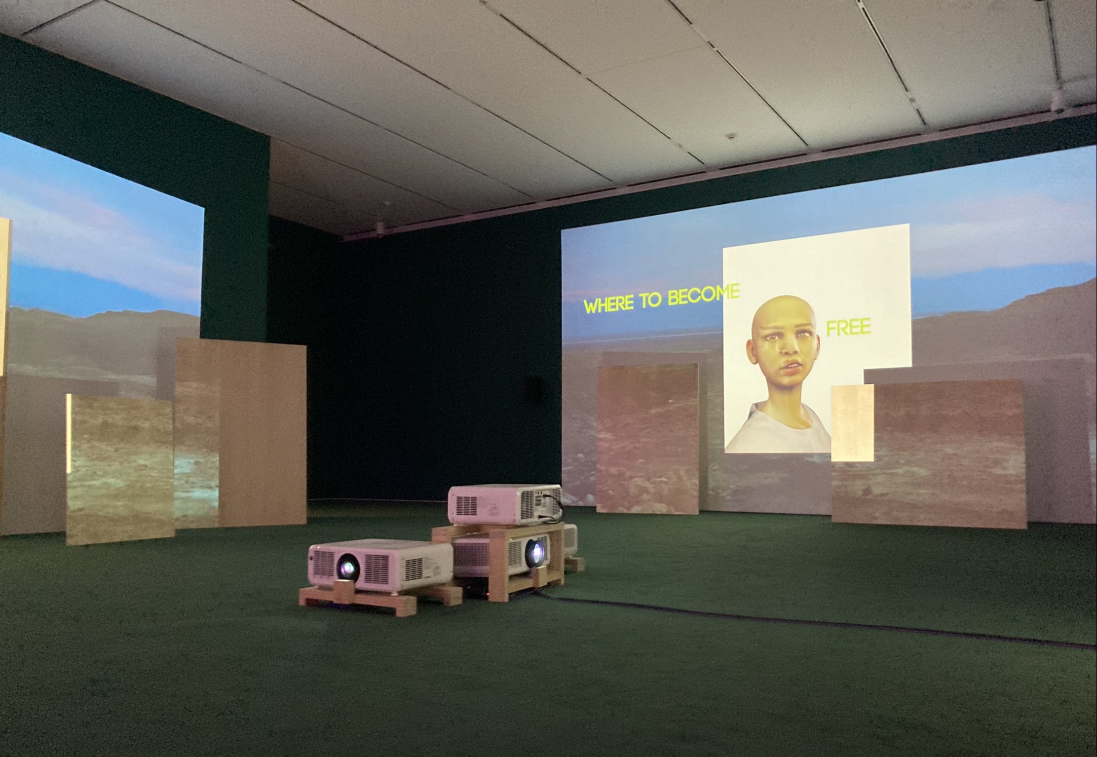
I tried to be optimistic when I heard that the Art Institute of Chicago was running Palestinian artists Basel Abbas and Ruanne Abou-Rahme’s exhibition If only this mountain between us could be ground to dust, from July 31, 2021 until January 3, 2022. It’s one of the very few shows the Art Institute of Chicago has organized featuring contemporary artists from the Arabic-speaking world; it might even be the first, certainly the only in the last decade. The Art Institute’s permanent collection has a poor record when it comes to modern Arab artists, with only a handful representing the region, including Ghada Amer, Lalla Assia Essaydi, and Jacob El Hanani. Compare that to the dozens of Warhols perpetually on display.

Continue reading “The Limits of Palestinian Art: An Exhibition Review of “If only this mountain between us could be ground to dust””

The Pen’s Screech: Muslim Spiritual Practice of Arabic Calligraphy

By Noman Baig

A 2' x 2' white paper sheet depicts Arabic letters in modern Kufic. Each letter is painted in gold and brown watercolor. The letters are composed in an upward and downward style and overlaid on each other.
Figure 1: Arabic letters in modern Kufic, 2’ x 2’, Alina Baig

To propose and teach a practice-based course in a highly academic setting is a formidable task. Practitioners usually face resistance from theoretically minded academics who perceive hands-on training as a lowbrow vocation. Last year in 2020, after practicing Islamic calligraphy for a year under a disciple of Kashif Khan (b. 1978), I decided to teach an undergraduate course on the subject at the newly established liberal arts college Habib University in Karachi, Pakistan. My home department, Social Development & Policy, rejected my proposal on the pretext that traditional art has no place in developmental studies; that it does not address pressing challenges in the way the discipline of economics does.

After initial resistance, the newly launched Comparative Humanities program[1] agreed to host the course as a creative practice requirement. Designed as an experimental course, Divine Proportions: Introduction to Islamic Calligraphy fused drawing and thinking into a singular aesthetic experience of the Islamic arts. The challenge was teaching aesthetic theory in tandem with drawing. The gap was overcome when I took the lead in teaching the historical-mythical aspects of the art. The calligrapher Ustad Kashif Khan took the responsibility of teaching calligraphy. In the first half, students discussed the readings and delivered presentations. In the second half, Ustad Kashif Khan taught them the art of drawing letters.

Continue reading “The Pen’s Screech: Muslim Spiritual Practice of Arabic Calligraphy”

What is “Open Access,” Really? – A Comic

Art and Words by Marwa Gadallah

(Find the Arabic version of this comic here.)

“Open access” is any resource you don’t have to pay for, that is available online and that has less obstacles to copying and using material – in short, anything that is available for all.1 As a movement in information sciences, it has been praised, but in our particular contexts, in mine as someone who lives in the Arabic-speaking world, I wonder about its limitations. What does “available for all” truly mean? 

What open access is can be defined by cultural factors, like language, history and even the significance of computer literacy. I presented on this with N.A. Mansour at the Digital Orientalisms Twitter Conference in 2020 in both Arabic and English. But we thought a visual medium might help us provoke thought on this issue even more. 

Alternative text is also available for each comic panel.

A woman wearing hijab stands before a metropolis with large buildings and skyscrapers called "Archives of the Internet". Some are company buildings that belong to the online archives East View, Gale, HathiTrust and Bloomsbury.
Continue reading “What is “Open Access,” Really? – A Comic”

In Alienation: Arabic Typographic Matchmaking

By Marwa Gadallah 

Neue Helvetica Arabic (sample text),
designed by Nadine Chahin
e

If you were becoming an Arabic type designer, one of the things you would need to consider, oddly enough, is Latin type design: much Arabic type design involves creating Arabic counterparts to existing Latin typefaces, a process known as typographic matchmaking. The Arabic script was incorporated into printing technology –outside of Arabophone contexts for the purposes of those who studied Islam for both academic and polemic purposes– roughly a century after the Latin script: Gutenberg, the inventor of Latin movable type, didn’t design printing with the Arabic script in mind. Arabic is composed of 28 letters, which have four letterforms (isolated, initial, medial and final forms), thus requiring a large number of type pieces to be created and the process was time-consuming. Today, while the computer allows us to communicate in Arabic without having to worry about the multiple letterforms, out of the same Gutenbergian legacy comes typographic matchmaking.

In typographic matchmaking, a type designer studies the letterforms of the Latin typeface they are interested in and incorporates their features into the design of Arabic letterforms while maintaining their physical appearance as Arabic letters. An example is Neue Helvetica Arabic, based on the Latin script typeface Neue Helvetica. Typographic matchmaking represents a cultural and practical discourse that Arabic type designers engage in as they work with Arabic type: consequently, Arabic speakers have few typefaces that they can rely on for day-to-day uses.

Continue reading “In Alienation: Arabic Typographic Matchmaking”